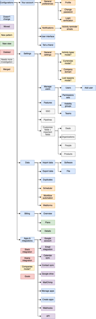
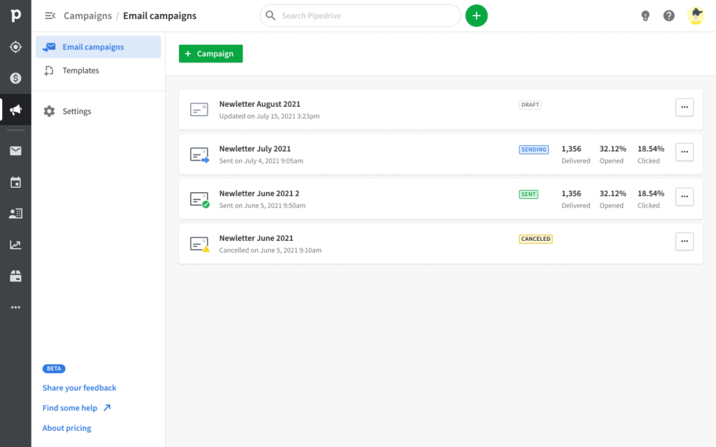
UX Strategy

Campaigns App

Design and integrate a brand new marketing product with an already well established CRM platform

Summary

Since its creation, Pipedrive was solely focusing on improving Sales team revenue by providing a robust Customer Relationship Management (CRM) product. After 10 years on the market, the company leaders realised that we weren’t growing with our customers as much as we could.

After conducting comprehensive market research, we discovered that High-Value Customers (HVC) couldn’t function efficiently if their business data was siloed and spread across multiple tools. Our new direction became clear: we needed to bring those external tools right in Pipedrive.

Since Pipedrive had just acquired Mailigen, a Marketing Email Software, it was decided to start implementing this multi-product strategy by bringing email marketing power right inside Pipedrive: the Campaigns app concept was born.

Campaigns by Pipedrive

Problem

We had a well-defined Sales persona in Pipedrive and a well-defined Marketing persona in Mailigen. On paper it seemed easy: Marketing customers and Sales customers are the same people at different customer lifecycle stages. Guess what? It wasn’t that easy.

First, we had to build the whole infrastructure to deliver emails. Luckily we had the really knowledgeable Mailigen team to help out in setting everything up.

Email campaign list view
Our brand new email campaign list section

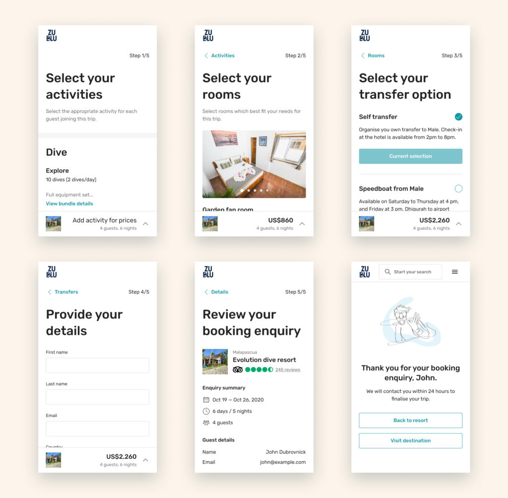
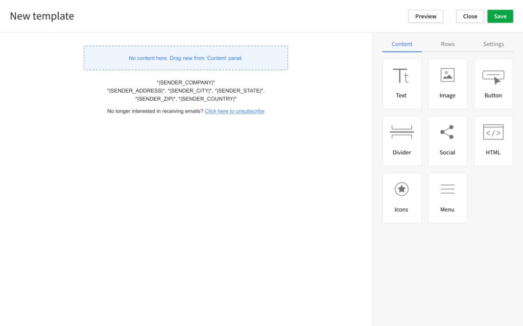
Second, we had to provide a solid drag-and-drop editor so that our customers could create beautiful email designs. We decided to use BEE Free email template editor to save engineering time. While they provide a great out of the box tool, it proved to be quite limiting for us as we were only able to modify their UI and had to keep the UX defined by their product team.

Email template editor
BEE Free email template editor

Third, and that’s when it got interesting, we had to make our current Sales contacts (a user’s customer) model work with our new Marketing contact model. On top of this, we had to deal with marketing communication legislation such as GDPR or the information act. Finally, since contacts can be hidden in Pipedrive, we had to figure out the impact of those visibility settings on marketeer flows.

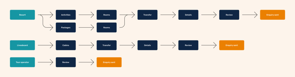
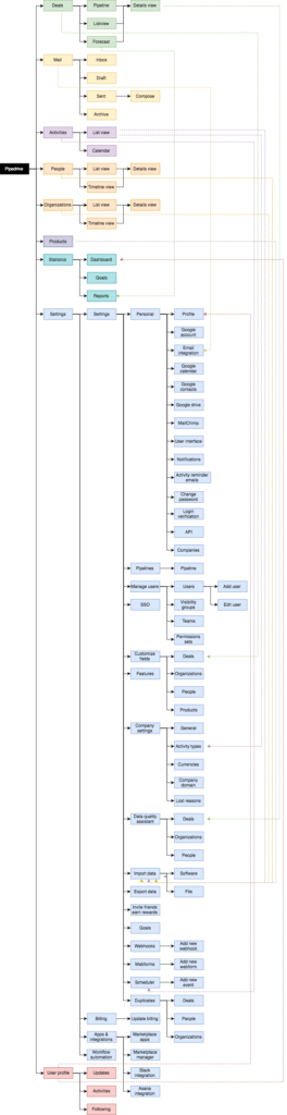
Since it was a 9 months month project, I will focus today on the Contact management mission which was delivered as part of that product development phase.


Role

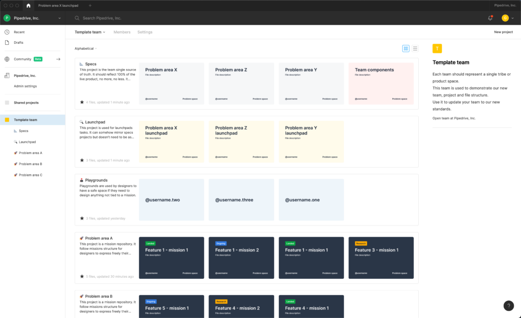
I was hired back in Pipedrive specifically for leading the design of this concept area. I worked closely with our Group Product Manager and Engineering Manager on the long term strategy and roadmap while delivering 2 or 3 missions in parallel. At the same time, I was providing guidance and mentorship to 8 other designers working on a variety of problem spaces.


Approach

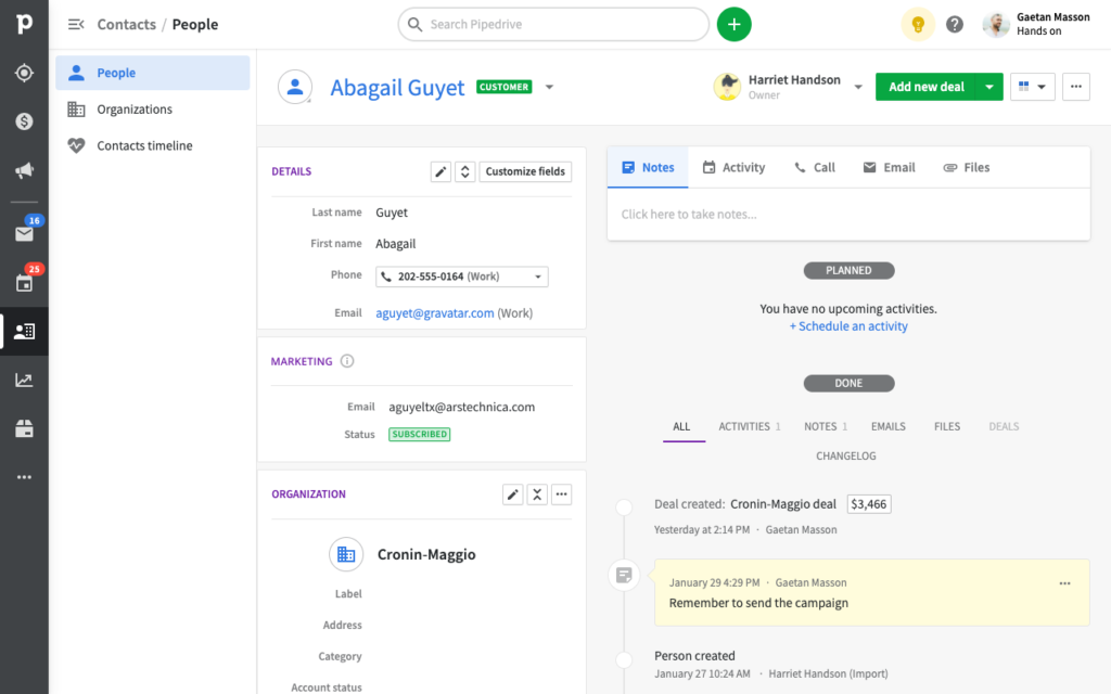
We started by first looking at what was the current contact requirement in Pipedrive. We started by researching our two personas what is a contact for them. For salespeople, contacts are people with whom they create personal, in-depth one-on-one relationships. On the other hand, marketing contacts are people with whom they create automated, broad large-scale relationships.

The sales contact model in Pipedrive was as follows:

  • Name (required in Pipedrive)
  • Email (not validated, not required, multiple)
  • Phone (not validated, not required, multiple)
  • Demographics for salespitch
  • Past behaviour for salespitch

The marketing contact model would usually be as follows:

  • Email or phone (valid, required and unique)
  • Marketing consent (as requried by GDPR, CAN-SPAM Act, and other legislations)
  • Name (not required)
  • Demographics for segmenting
  • Past behaviour for segmenting
Contact details view with new marketing panel
Due to existing constraints, we had to duplicate the email field used for marketing communication

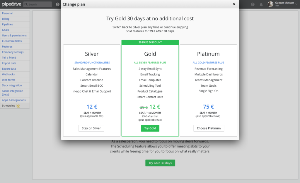
Finally, a major difference was our new marketing billing model. Traditionally Pipedrive had always been charging for its product on a per-user basis, the more salespeople you have, the more you pay. That doesn’t scale really well especially when automation allows the creation of highly efficient processes. To allow Pipedrive to grow with their user base, it was decided to bill for Campaigns App based on a per-subscriber basis.


Solution

Marketing status

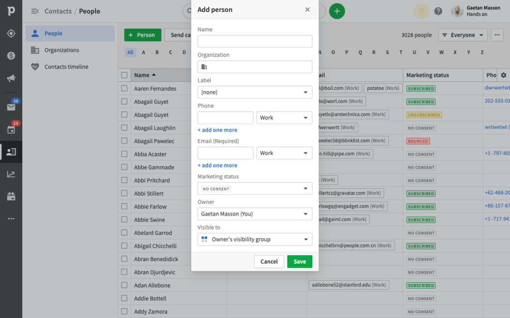
The first question that we should have asked ourselves was: what is this marketing status and how will users use it? At the time we were pressed by really tight deadlines and we didn’t have the luxury of spending much time on the question. All information regarding contacts is called custom fields in Pipedrive.

At the time it seemed obvious to me that our new status was behaving differently from other custom fields:

Marketing statusCustom field
Some values disabled the field (e.g. unsubscribed)Can always be updated by users
Some values are system-generated (e.g. bounced)Values are always user-generated
Tied to email fieldNot tied to any other custom fields
Tied to our billing modelNot tied to a billing model
Updated by users’ customers’ actionsUpdated by users’ actions

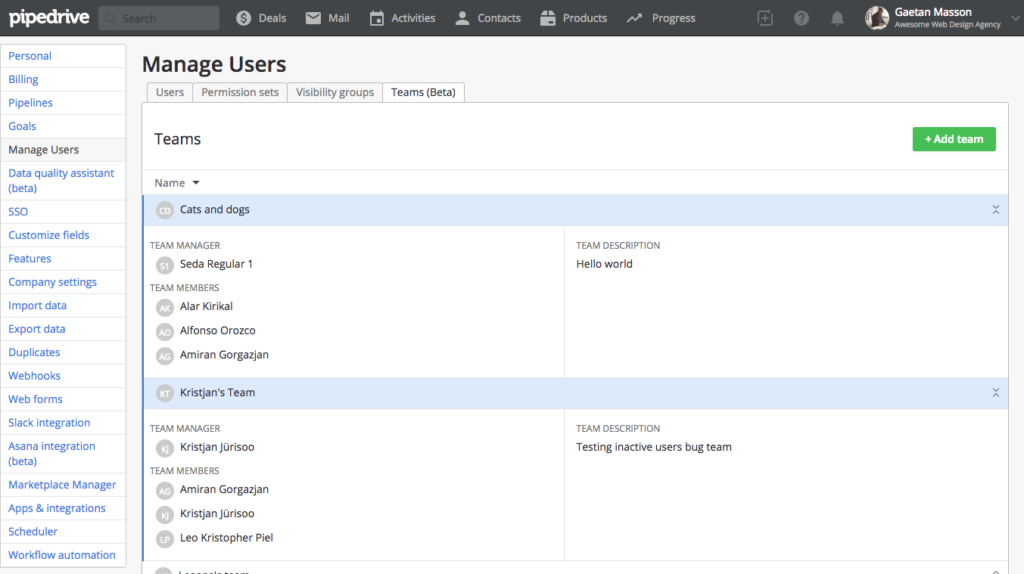
Based on this observation, I advocated creating the Marketing status as a new type of field reflecting those differences. Sadly, since the contact model wasn’t owned by anyone in the product organisation, it was decided for the sake of speed to develop this new field as a regular field with extra logic.

Marketing status became just another custom field

Updating contact status

We went through a lot of ideation and test phases with the Product Manager (PM) and the Engineering Lead (EL).

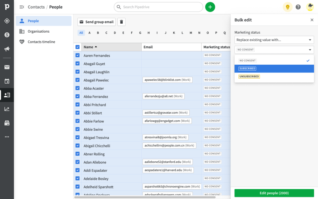
The first solution we wanted to explore was to design a new pattern for updating multiple items in list views: bulk actions. We already had the bulk-edit functionality in Pipedrive which allowed users to change multiple field values at once. Bulk actions would be similar but would always act on the whole contact rather than on a particular field (e.g. deleting, sending group email or subscribing to marketing communications).

The initial proposed solution was to introduce Bulk Actions in list views

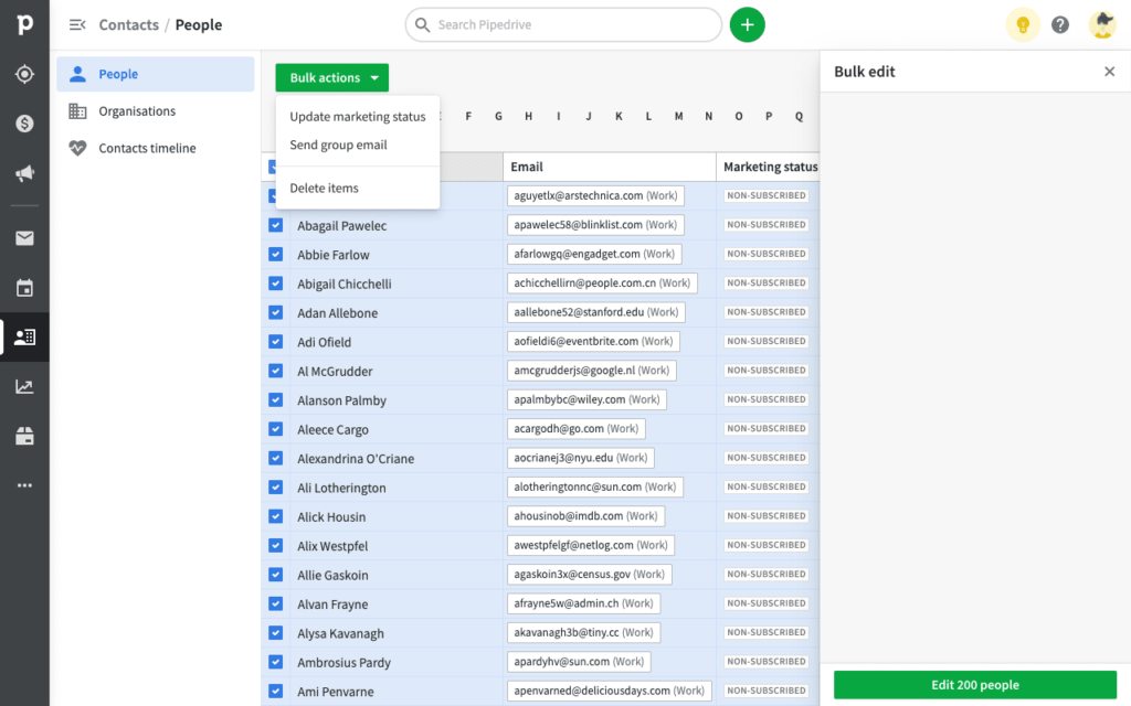
This solution seemed promising but there was a lot of pushbacks from both engineering and design alignment teams. At the time, stakeholders couldn’t see value in branching from current patterns. For them, marketing status should be treated as a normal field and therefore use the available bulk-edit function.

In the end, the PM and EL decided to follow the alignment teams advice because it was saving us a lot of engineering effort. If we would have gone with the bulk-actions pattern, which had some supporters too, we would have had to get all list views refactored and a lot of stakeholders to agree on this change.

Bulk edit solution proved to be clumsy at best since it wasn’t tailored for our new status behaviour

Challenges

It was really complicated to produce something functional with so much legacy and stakeholders. Contacts are one of the oldest entities in Pipedrive and with it came a lot of baggage. The biggest challenge for me was to keep on getting setbacks because of engineering constraints. I can’t even count how many times I heard: “Gaetan, do you have a minute? We can’t build the flow which we have agreed because service X is not exposed”.

I had to redesign the whole flow many times, and in the end, I had to settle for a solution in which wasn’t optimal. I spent the next 6 months advocating for a follow-up mission as well as getting proper ownership for the contact entity. I luckily succeeded in both with a campaign recipient management mission added to our roadmap and a Product Manager allocated to contacts management.


Results

A couple of months ago, we released the first Beta version of the Campaigns App to a few selected customers. So far adoption has been pretty low. We have conducted around 20 user-feedback interviews on different topics to gather their first impressions. When looking at contact management, users almost always managed to successfully change marketing statuses.

We noted that:

  • User weren’t trying to match marketing statuses with the ones in their current tools
  • They didn’t seem to care about customer constent as much as we thought they would
  • They could figure out how to update statuse but didn’t understand why it sometimes behaved differently from other custom fields (Unsubscribed status can’t be changed)
  • Some users find really intuituve to use Pipedrive filtering to organise contacts but others were looking at building segments
  • Buld updating status could have unpredictable results and no post-update summary

Before I left Pipedrive, more usability testing was planned to scope for the next mission planned on this topic: Recipients Management.

Design Ops

Single Source of Truth

Scaling a design file structure to function with an ever growing design organisation.


Problem

When I first joined Pipedrive in 2018, we were around 15 members in the design departement. By 2021, the team had grown to 50+ people. During those three years, the management team started to get more and more negative feedback regarding design specifications. The problem was starting to get out of hand and we decided to investigate.

After conducting key stakeholder interviews, our discoveries were as follows:

  • Stakeholders (Product Managers, Engineers, Content Writters, etc.) struggled to find the latest version of a live feature
  • Functionalities weren’t always clearly documented anywhere
  • Projects were mostly created from scratch and ended-up being not aligned between teams
  • Security was poorly managed, external stakeholders could sometimes access business sentive data

Since at the time our Design Operation department consisted of only one person, he had little time to spend looking at design documentation organisation. This meant that some teams were using location-based names or that the files of a single project could be split between many teams.


Role

As Product Design Lead, part of my role was to create and improve designer processes both before, during and after missions. Because we had to move extremely fast with Campaigns App (13 missions in 6 months), I became really interested in the most optimal way of defining what was currently live, what was being engineered, and what needed small improvements.


Approach

Since this project was touching every single designer in Pipedrive and would require quite some operational effort, we decided to start by defining a proper scope.

There are three different levels that needed to be tackled:

  • How should the design organisation structure Figma on a high level (teams, projects)?
  • How should each product area organise Figma on a low level (files, components)?
  • How can we efficiently communicate designs overtime to multiple stakeholders?

Solution

Figma teams and projects structure

We started by creating an underlying set of Dos and Don’ts for team leaders to understand the logic behind the new proposed structure.

DosDon’ts
Use problem spaces for team namesUse location or feature names for team names
Use the “Specs” project for what is 100% live after a mission has landedRandomly mix mission and specs files
Update the “Specs” file in the team where it belongsCreate multiple “Specs” files for the same feature in different teams
Give project access only to stakeholders who actively need itGive project access to anyone
Remove access when stakeholders don’t need it anymore (eg. change of tribe or role)Leave permanent access to stakeholders regardless of organisational changes

Team level

To organised our department properly, we started by defining teams and aligning the way projects were created among them. Here is a few examples:

  • Design system – public web
  • Design system – web app
  • Sales
  • Leads
  • Marketing
  • Settings
  • Billing

Project level

One level down from teams in the file tree, we have projects. The most important part for us was to provide places where:

  • any stakeholder could find anything live in the product
  • team stakeholders could find tweaks needed to fix the live product
  • designers could express their creativity during projects
  • designers could have non project related explorations

To meet reflect those needs, each team is structured with the following projects:

  • Specs: source of truth with what is 100 %live for users, open for to all company
  • Launchpad: contains launchpad tasks, open for team members
  • Playgrounds: contains non-mission related exploration, open to only designers
  • Mission projects: contains all mission related iterations, open to only mission members
The new Figma team and projects organisation

Figma file structure

Regarding file structure, we’ve interviewed stakeholders to understand what was needed for them to efficiently use design files. Based on our interview results, people needed to find:

  • a feature main views
  • particular feature states
  • the feature functionalities
  • who is responsible for a particular feature designs

To meet those needs, we created the following sections

  • Masters: main feature views (usually filled state)
  • States: feature states (e.g. loading, empty, error, etc…)
  • Flows: feature prototypes (e.g. create item, delete item, duplicate item)
  • File thumbnails: name of file owner and problem space

This section list is by no means exhaustive and different sections could be added as long as the four previously mentionned were present.

The new specs file structure

Challenges

The main challenge presented itself during the project implementation. Pipedrive design department had felt the pain of switching design tools when moving from Sketch to Figma the previous year. At the time not much attention had been put into structuring design teams and files so that the department could grow exponentially. This year, no one wanted to ask designers for extra operation work. But it has to be done and Design Leads formulated a plan to overcome any added friction.

First, they organised a management workshop to get all Leads on the same page. Then, they got back to their respective teams and gave designers a full day to focus on reorganising their files. Designers weren’t expected to finish everything in one day but had to finish the project over two months with a clear deadline.


Results

The teams in which this project was piloted gave a lot of positive feedback. They reported:

  • Easier to find latest version of a live feature
  • Being less scared of overriding master files during project ideation
  • Reduced time to create or update design files

It was quite fun to work on this project because it was the first time I worked on design ops related topic at that scale. I had to collaborate with multiple Leads and Designers and I was able to test it and tweak it with Designers from my own team.

UX Strategy

Suppliers search tool

Redesigning a supplier search flow so that it incorporates multiple verticals and matches users' mental model.

Summary

ZuBlu is a dive travel startup revolutionising its market by allowing customers to book sustainable accommodations and diving trips at once.

In June 2020, after adding 3 senior engineers to our team, we decided to tackle the most complicated project left before being officially done with our whole platform redesign. The problem was as follows:

How can users efficiently find, compare and select suppliers?


Problem

When it was created, ZuBlu was offering two product verticals: resorts and liveaboards. In those two verticals were subtypes such as packaged resorts (resorts with fixed lengths of stay) and charter boats (the whole boat is rented by a group). Later on, we added other verticals such as day trips and eco-ventures which brought it to a total of 4 verticals.

The old search was mixing verticals and displaying way too much information

The global search input would allow users to search for non-product items such as articles or destinations but would only allow them to search for specific product items by name. It was impossible to make a general search and reach a product search result view from this entry point.

The previous design wasn’t allowing users to access search with the search input

The only way to do so (eg. searching for resorts in Bali) was to use a wizard located on the home page. If users would find it and land on the result page, all product verticals would be mixed together and filter options would be either vague or overly complicated.


Role

As the only designer in the team, I was responsible for producing all design-related materials. Our team consisted of 3 Engineers and 1 Product Manager. I was particularly excited by the project since it was directly impacting our user’s core experience.


Approach

This search project was the most interesting and impactful project I tackled with ZuBlu. This functionality is a heavy piece of engineering and it’s one of the most important features for a travel platform. How could we make sure to bring high value to users while delivering the project in a reasonable timeframe?

Research showed that users were likely to browse for a single product vertical at a time. Based on this, we decided to separate our product verticals and provide dedicated search results for each of them. This decision allowed us to customise the search widget, search filters and search results for each supplier type. A second decision was to keep results as close as possible to what they were. This allowed for a much-reduced development time. After settling on this design direction, we proceeded with user-testing and iterating.

We first tried to include product verticals and the search widget on result pages before deciding otherwise

Solution

User testing showed that splitting verticals into their own search result was the correct way to go. Users understood our information architecture easily and were finding the right products quickly. Since we wanted to save development time, we decided to keep resort search results as close as what we already had.

Splitting verticals allowed us to tailor the user experience for each type of supplier

Now that we had dedicated search results, we were able to display liveaboard trips and itineraries directly in the results. That allowed us to dramatically increase pricing transparency and reduce by 10 folds user-salesperson interactions needed in order to close deals.

The new search widget allowed us to customise inputs for each vertical

The part which took the most time to get right was the search widget which came to replace the search global input. The widget had a lot of user interactions and was the functionality main entry point. We took inspiration from Airbnb’s solution and tailored it to our needs. After testing a few iterations, we settled on a solution that was functional, doable with our current tech stack and reduce engineering overhead.


Challenges

The main challenge we encountered when tackling this project was related to the result accuracy. Both quick search (suggestions provided while user types in search input) and search results needed to be contextual and accurate in order to be functional. How could we make sure that users found the right destination or the right supplier?

To solve this challenge, we decided to only allow users to search for destinations like “Bali” or “Maldives”. Highly specific searches like “Dive with manta rays in South-East Asia” wouldn’t be permitted. Then we implemented suggestions in our quick search results which followed our information architecture: first countries, then regions, then destinations and finally suppliers. The more specific users input would be (ie. typing more characters), the more specific the search results would become (ie. looking down the information architecture tree).

We kept the flow as simple as possible and only allowed to search for specific destinations or suppliers

Finally, we decided to stay away from providing search results based on search frequency (ie. displaying most searched results first) since we didn’t have enough traffic on our platform at the time.


Results

At the time of writing this case study, we have had really little user feedback regarding this project. The global pandemic and the travel limitations it created prevented people to travel and platform traffic came to a halt for months. Now that some countries start to reopen, we will monitor results and iterate on our current solution.


Learnings

The main learning we had during this project was related to the global situation. How can we test a solution when users are not actively using it? I always advocate for evidence-based design with pre and post design research to allow learnings and iterations, yet sometimes, going with one’s assumptions, quick guerrilla testing and later monitoring live results is a quick and efficient way for small teams to deliver fast.

Interaction design

Product checkout

Building a checkout flow allowing users to book accommodation and marine activities in a few clicks.

Summary

ZuBlu is a dive travel startup revolutionising its market by allowing customers to book sustainable accommodations and diving trips at once.

In October 2019, when I joined ZuBlu’s team, they were fresh out of the Betatron accelerator program in Hong Kong. Until that point, all designs had been made by Adam, ZuBlu’s CEO, and it was developed by Digital Butter, a local web agency. After analysing the state of the product, we decided to focus on a major question:

How could we improve users’ checkout experience?


Problem

When we started working on this project, the default booking flow was:

  1. User visits a supplier page
  2. User starts an enquiry
  3. User fills-in a form
  4. User enquiry is sent to ZuBlu’s sales team by email
  5. Salesperson manually starts the conversation
  6. Many backs and forths between sales team and user to define his or her needs
  7. Salesperson checks rooms availability with a chosen supplier by email
  8. Supplier answers yes or no
    1. If yes, our salesperson validates trip and sends a payment link to the user
    2. If no, the user is back to step 6
  9. User pays with a payment link
  10. User receive a booking confirmation
The initial checkout experience was a simple form

In the form step, users weren’t presented with the final price. They were only shown an average room price per night and limited options to customise their trip. The form was actually well below the fold. Unique Selling Points were still presented to users at this stage while they should be displayed higher in the sale funnel if at all necessary.

After completing this step, it would take up to a few weeks of back and forths between the user, our salesperson and our suppliers to conclude a deal. The experience was functional but felt incomplete and clunky compared to the ones provided by industry leaders such as Airbnb or Booking.com.


Role

When I started working on this project, ZuBlu was outsourcing everything. There weren’t any Designers, no Product Managers and only a single part-time Engineer. Because the team was so small, I was paired directly with Adam, our CEO, and provided input on many different topics such as marketing, engineering and of course design. For the first time, I had the chance to use most skills I had acquired during my career.


Approach

We researched and defined what was missing for users to enhance their purchase experience on our platform. We first looked at what other direct and indirect competitors were doing. We then proceeded with users and internal salespeople surveys to learn what was the most important information users needed in order to make a successful purchase.

Airbnb clean checkout experience

After analysing the results, we realised that most users would be either certified divers or want to learn scuba diving, that the average booking would be 2.2 guests and that users only needed some basic but valuable customisation options. Based on these findings, we decided to limit trip customisation options. This would allow us to create a simple and quick user flow for the majority of our users.

Our simple user flow

We created a 5 steps flow where users could select activities (diving, snorkelling, learning), select rooms (type and amount), select transfer options (self-transfer, car, boat, etc.), provide their details (name, email, phone, etc.) and finally review their enquiry before sending it over. Amount of guests and travel date would be informed on the supplier page, before entering the booking flow.


Solution

After testing different iterations, we validated three different flows for custom resorts, package resorts and liveaboards. On top of this, we added a quick checkout flow for large groups, activities and eco-ventures. This quick flow allows our sales team to handle group bookings which usually need more customisation and provide higher revenue.

The whole flow was designed with a mobile-first approach

The default flow booking flow was now:

  1. User visits a supplier page
  2. User starts an enquiry with dates, amount of guests and amount of rooms
  3. User completes a 5 steps checkout:
    1. Activities
    2. Rooms
    3. Transfers
    4. Details
    5. Review
  4. User enquiry is sent to the users for confirmation, to the sales team in Zoho for follow-up and to the supplier for availability request
  5. Supplier answers yes or no to email
    1. If yes, our salesperson validates trip and send a payment link to user
    2. If no, our salesperson picks up the conversation and offers another resort to the user
  6. User pays with the payment link
  7. User receive the booking confirmation
Each step focuses on solving a single part of the vacation equation

With each flow, we were able to solve our pricing transparency and trip customisation issues for 90% of our users. The last 10% of users who might need in-depth customisation are invited to contact our sales team directly so that we can create the perfect trip for them. We went from an average booking process length of 7 days to an average of 2 days.


Challenges

During ideation, we realised that one of our product subcategories, package resorts, was much more complicated than anticipated. It had much more constraints than its sibling, custom resorts. This type of resort would only allow users to arrive on certain weekdays and for a fixed amount of time. They would have prices per user type (diver, non-diver) rather than prices per room type which would create a complicated price matrix that seemed neither easy to grasp nor flexible for users. 

Package resorts provide all-included packages rather than separately priced rooms and activities

After exploring different solutions and based on the fact that most bookings had only 2 guests, we decided to greatly simplify this product by allowing users to select only a single room type rather than multiple rooms from any type. This greatly simplified the price matrix for 90% of our users.

Some product specificities are to predict and can only be discovered through user testing. When we first tried to apply the custom resort flow to our package resort product, we quickly hit a wall and had to go back to the drawing board.


Results

At the time of writing this case study, we have had really little user feedback regarding those two valuable functionality redesigns. The global pandemic and the travel limitations it created made our business and platform traffic to a halt. We will monitor the result of this work in the coming months when international vacations resume which will, in turn, allow us to iterate on the current design.


Learnings

The main learnings acquired during this project have been more related to the global situation rather than the design process itself. How to test a solution when no one uses a product (no international travels in 2020)?

I always advocate for evidence-based design with proper research to learn and iterate, yet sometimes, going with one’s assumptions, quick guerrilla testing and monitoring live results is a quick and efficient way for small teams to deliver fast.

Information architecture

Settings and configurations

Remodelling a settings information architecture so that users can easily configure an app to fit their needs.

Summary

When products get more and more complex, things can progressively get out of hand. In 2018 we had been adding complexity to our product for more than 10 years. After spending a year shipping cool features and improvements, I could feel an issue growing and I started asking:

How can we start making sense of our settings and configurations?


Problem

Over the years, every product organically becomes more complex. New features are added and users need to configure them. For example in Pipedrive’s case, new users needed to get their pipelines matching their sales processes, invite their colleagues or link Pipedrive with their existing tools. It happens sometimes that whole features such as security ones are app configurations.

Settings left menu was getting out hand with more than 20 items

In 2017, over the course of one year, Pipedrive added more than 10 new features to its web app and increased functionalities of many existing ones. The settings menu jumped from 10 to 25 items. This huge section of the product was getting cluttered and unusable. Since research showed that trial users who would configure Pipedrive to suit their needs were 60% more likely to convert to paying customers, we decided to tackle this issue.


Role

From my first day at Pipedrive, I worked on features related to ecosystem (app marketplace), configurations (billing, user management) and product marketing (in-app upselling). One of my major skills is breaking down complicated problems into actionable items while managing stakeholders expectations. Because this issue had consistently impacted my work, I was eager to focus on this design problem.

As Lead Product Designer for this project, I had to interact with more than 13 different product teams. I had to make sure that we would meet their requirements, keep legacy features functional and allow users to achieve a variety of goals.


Approach

Most of Pipedrive’s features have some kind of configuration page and some features, such as workflow automation, are located in settings. With more than 50 unique views, the settings section was at the time the largest of the product. We decided to step back and analyse where we were starting from and what would be the right information architecture.

Settings represented more than 70% of Pipedrive

We started by creating a product map for the whole app to visualise its current state. This map made us realise the extent of the problem: there was no logical information architecture in place. To make sense of this, we decided to proceed with an open card sorting exercise.

Open card sorting results

We listed all actions a user could take in settings and assigned each one to a card. We conducted one on one interviews where we asked users to logically group all our cards. Upon completion, they labelled each group based on its content. After reviewing the results, we sat with our stakeholders to group all our configuration options into sections and subsections.

The proposed settings information architecture

From there I build a Vue.js prototype to test and iterate on different grouping and UI approaches. At that point, we had many questions to answer:

  • Would it be better to have a feature configuration inline (sitting in the feature itself) or sitting in settings?
  • How will users discover a feature or a global setting?
  • Should settings be managed by each individual team and how can everything stay aligned?

Instead of imposing rigid processes or constraints to our product teams, we decided to create a framework where each team could implement their own settings. We would still be there to check that everything would be aligned and we would be available to advise teams when they had to create new settings views.


Solution

After testing 7 different iterations, we settled on one which fitted our user mental model and our product requirements. We defined four buckets:

  • Settings
  • Billing
  • Tools and Integrations
  • Workflow automation

We decided to bring some configurations out of settings and treat them as features. We also encouraged product managers and product designers to use in situ configurations whenever appropriate so that users could instantly see changes without having to move out and back to the feature.

The new settings navigation UI

Since I have left Pipedrive the solution has kept on evolving. The main navigation was redesigned which in turn modified settings information architecture further. Because of our new settings framework, designers and product managers have already made use of the solid foundations we created.


Challenges

The greatest challenge in this project was to define ownership and manage expectations. This project involved 13 different teams across 3 offices. We could say that the settings section was owned by everyone and by no one at the same time. It has been developed for 10 years and had a life of its own. I remember when we started looking at it all and told each other: “All right, where the hell do we start?” Everyone wanted changes to happen but no one had time to work on it.

Those challenges were met with a passion for creating awesome products and improving our users’ lives. All teams got behind us and slowly but surely we managed to bring this project from a coffee break chat to a full-blown adventure where people felt empowered.


Results

The project delivery was really well received. We successfully created a framework for all product teams to work with feature configurations. Obviously, this is an ongoing project. Existing and new features configurations will need configurations. Our proposed solution paved the way for the new navigation redesign and the creation of a product team dedicated to settings and configuration.

Latest version of Pipedrive settings made possible by our framework

Learnings

There were so many different learnings during this project that I’m not sure where to start. First it was a really great adventure. I got to work with every single product manager and designer or Pipedrive. I improved a lot regarding communication and managing stakeholders’ expectations. 

Secondly we really saw the value for a designer to be able to code simple prototypes and get them tested. This allowed us to easily share our progress with other stakeholders and get support from everyone involved. 

Finally, I learned that there is no right or wrong time to start a project. If something really interests and triggers you but no one seems to care and pay attention, start working on it a few hours a week, slowly get your management to see the value and at some point, it might become a company priority.

UX Strategy

Tiers up and down

Improving features discovery and creating account upgrade flows to increase growth and revenue.

Summary

Pipedrive is the first CRM platform made for salespeople, by salespeople.

Designers, marketers and product managers love to regularly add new “cool” features to their products. But we started shipping 3 or 4 new features a year, a couple of questions started crossing our minds:

How do users discover new features and their value?

How do users upgrade their accounts and have access to extended functionalities?


Problem

When a product has a solid user base, such as the Pipedrive’s one, comes a time when management wants to make sure that company’s growth rate stays steady. Pipedrive at the time offered a 14 days free trial followed by three paying tiers: silver, gold and platinum. Before we started this project 90% of users were using the Silver offer. The Gold tier was offering minor functionality improvements if not for the Email Inbox functionality. The Platinum tier was mostly a marketing trick encouraging users to subscribe to our mid-tier offer: Gold.

The only way of upgrading an account was through the old pricing modal. It was only accessible from the billing view and had CTAs placed below the fold.

To boost revenue, our management decided to redesign our two highest tiers. Gold tier was to be tailored for midsize companies with features such as workflow automation or email templates. Platinum tier would focus on the corporate market with security features such as two-factor authentication or single sign-on. We had 3 months to figure out how to raise user awareness about those new functionalities, help users understand their value and encourage users to easily upgrade their subscriptions.


Role

For this project, I was given the Lead Product Designer role. I joined one of our product marketing engineering teams. I was tasked to research how to promote each new feature, coordinate delivery dates with each team tasked to implement the marketing material themselves, make sure that it was implemented according to specs and produce a simple solution for users to upgrade their plans.


Approach

The first thing we did was to define the problem better and divide it into actionable items:

  1. How can paying users discover features from higher tiers?
  2. How can paying users understand the value of features they don’t have access to?
  3. How can paying and trial users easily upgrade or downgrade their subscription?
  4. How can trial users know on which tier they are currently using the app?

The first two issues were explored with the product marketing team. We already have a solid idea of what we wanted to do there. We had some quick brainstormings to define the direction and started ideating on potential solutions.

Users couldn’t easily understand what was their current pricing tier during their trial

The third and fourth issues were solved together with our sales and billing team. The billing functionality was one of the oldest legacy features still in production. Our engineering options were limited here and we needed to deliver this fast. We couldn’t launch our new tier revamp if users couldn’t upgrade their subscriptions.


Solution

In order to solve our first problem regarding higher tier features discoverability, we decided to simply make the features visible in our navigation and to add a simple icon next to their labels. Before, users from lower tiers were totally blocked out of those features and not even aware of their existences.

We added a subtle icon next to feature labels and created custom empty states for each feature tied to a higher pricing tier

The second problem was solved by creating custom empty states for each feature. Now that users could discover them, we provided them with more information about the functionalities. Each empty state was designed in collaboration with the designer owning the feature and implemented directly by his or her team. Empty screens would include a UI sneak peek related to the feature goal, a little tagline and an “Upgrade” CTA.

The third issue was tackled by designing a modal presenting each tier’s features and price. This modal was made as a global component and could be triggered from anywhere in the product. The main issue here was allowing users to understand the value of each tier. We couldn’t just list 40+ features in Platinum without making the modal unusable. We decided to break away from the way our marketing team was displaying features on the web. We only displayed features belonging to each tier, clear pricing and an “Upgrade” CTA.

The redesigned modal clarified pricing and moved CTAs above the fold

The fourth and final problem was dealt with by adding tier badges to our top bar for trial users. Clicking on the badge would open our billing modal and allow users to compare our subscription plans. In addition to this we added a trial length reminder next to the badge so that users could plan and make the best out of their trial period. Since we increased the trial length to 14 days as well as the price of each tier, it was important to increase trial and pricing transparency.


Challenges

With so many issues to tackle, there were a variety of challenges. We had to handle legacy features that no one really wanted to deal with. Billing for example was still part of the monolith PHP code and hadn’t been updated with microservices. That made it difficult to improve the user experience there, hence the use of a modal rather than a checkout page. 

Another challenge was to deliver meaningful empty states for each team to implement at the right time. There was a strong push from our management to get enough features ready for the pricing and tier relaunch. All teams were working night and day to get their part over the finish line and we had to use a lot of diplomacy to have them buying in our project.

Another challenge was related to finding the right marketing strength. We strongly believed that our Gold tier was the one offering the best value for money and the best functionalities. We encouraged users to subscribe for this tier but at the same time we didn’t want to be pushy or upsell users with a product they didn’t actually need.


Results

One great thing about this project is that we could easily measure success. After three months, we look at our metrics and see what happened. Which percentage of users were now on the Gold plan? Had the trial to paying customer conversion rate increased?

After analysing the data, we were pleased to see that Gold tier conversion went up from 9% to 47% of trial users and Platinum tier conversion go up from 1% to 5% of trial users. It seemed that trial users were seeing the value in our Gold tier offer and were willing to commit to that tier.

On the downside, we reported a decrease in our trial to paying customer conversion rate. We knew that by increasing all our tier subscription fees while putting trial users on Gold tier by default, we were taking the risk of lowering conversion rate. Since it was the case, we decided to investigate further and iterate based on the investigation feedback.


Learnings

This project was my first official project at Pipedrive and I learnt a lot from it. I realised that managing stakeholders’ expectations is primordial and ensures success. Being clear from the start on the goals we wanted to achieve and the resources at our disposal, helped us get everyone’s support. 

I learned to deal with feature legacy and engineering limitations. We often asked ourselves: what is the best we can make of the current situation within our current deadlines? We had designed for the best case scenarios before realising that our user flows would take 6 to 9 months to build while we only had 3 to deliver our project. This was a hard-learned lesson and we had to go back to the design board and start all again.