UX Strategy
Suppliers search tool
Redesigning a supplier search flow so that it incorporates multiple verticals and matches users' mental model.
Summary
ZuBlu is a dive travel startup revolutionising its market by allowing customers to book sustainable accommodations and diving trips at once.
In June 2020, after adding 3 senior engineers to our team, we decided to tackle the most complicated project left before being officially done with our whole platform redesign. The problem was as follows:
How can users efficiently find, compare and select suppliers?
Problem
When it was created, ZuBlu was offering two product verticals: resorts and liveaboards. In those two verticals were subtypes such as packaged resorts (resorts with fixed lengths of stay) and charter boats (the whole boat is rented by a group). Later on, we added other verticals such as day trips and eco-ventures which brought it to a total of 4 verticals.
The global search input would allow users to search for non-product items such as articles or destinations but would only allow them to search for specific product items by name. It was impossible to make a general search and reach a product search result view from this entry point.
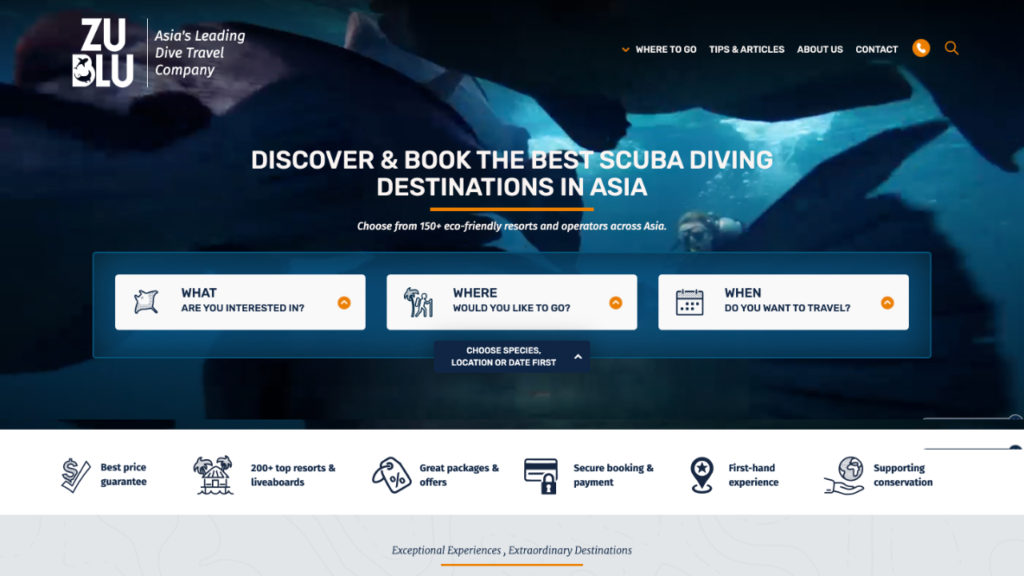
The only way to do so (eg. searching for resorts in Bali) was to use a wizard located on the home page. If users would find it and land on the result page, all product verticals would be mixed together and filter options would be either vague or overly complicated.
Role
As the only designer in the team, I was responsible for producing all design-related materials. Our team consisted of 3 Engineers and 1 Product Manager. I was particularly excited by the project since it was directly impacting our user’s core experience.
Approach
This search project was the most interesting and impactful project I tackled with ZuBlu. This functionality is a heavy piece of engineering and it’s one of the most important features for a travel platform. How could we make sure to bring high value to users while delivering the project in a reasonable timeframe?
Research showed that users were likely to browse for a single product vertical at a time. Based on this, we decided to separate our product verticals and provide dedicated search results for each of them. This decision allowed us to customise the search widget, search filters and search results for each supplier type. A second decision was to keep results as close as possible to what they were. This allowed for a much-reduced development time. After settling on this design direction, we proceeded with user-testing and iterating.
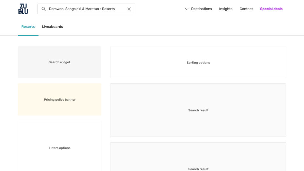
Solution
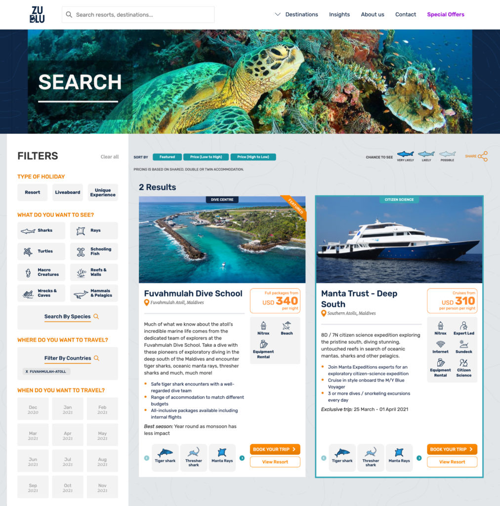
User testing showed that splitting verticals into their own search result was the correct way to go. Users understood our information architecture easily and were finding the right products quickly. Since we wanted to save development time, we decided to keep resort search results as close as what we already had.
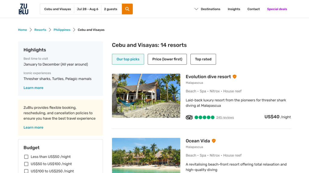
Now that we had dedicated search results, we were able to display liveaboard trips and itineraries directly in the results. That allowed us to dramatically increase pricing transparency and reduce by 10 folds user-salesperson interactions needed in order to close deals.
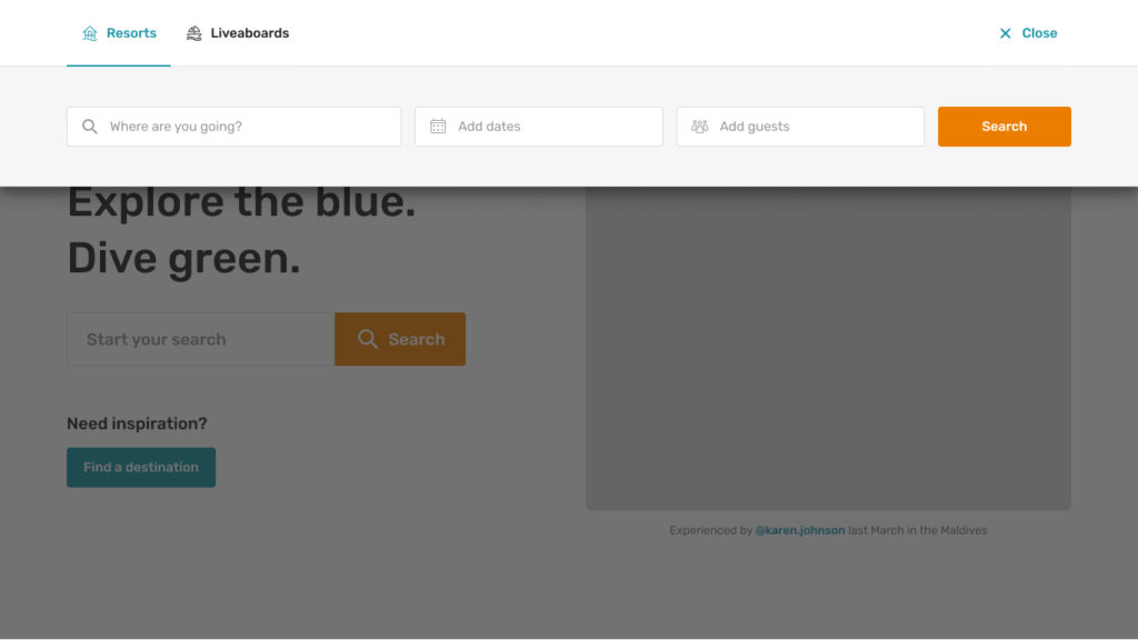
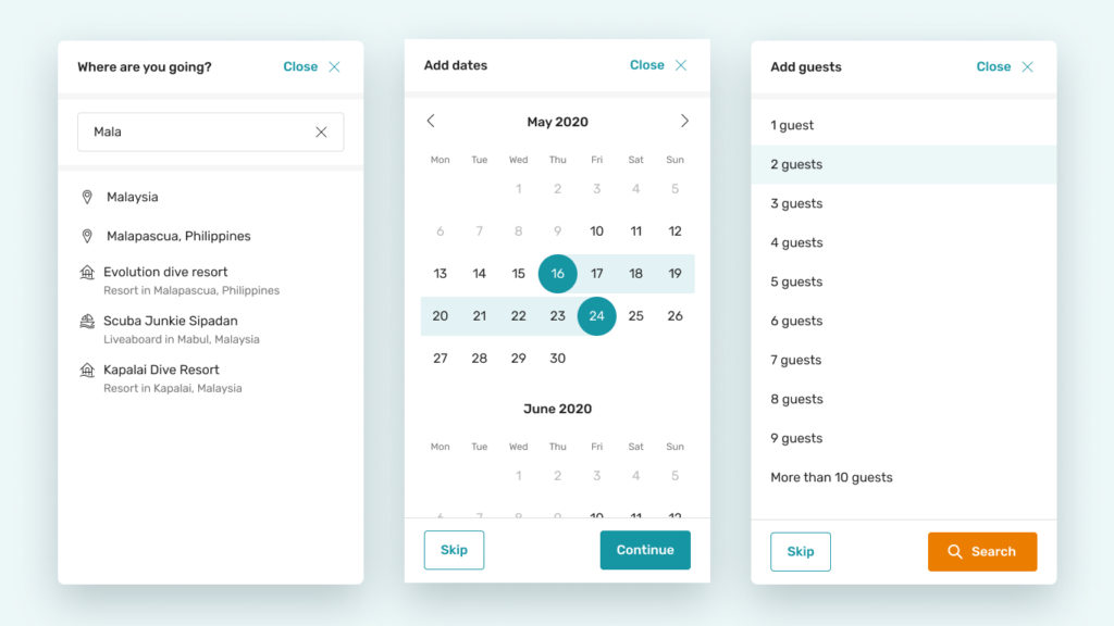
The part which took the most time to get right was the search widget which came to replace the search global input. The widget had a lot of user interactions and was the functionality main entry point. We took inspiration from Airbnb’s solution and tailored it to our needs. After testing a few iterations, we settled on a solution that was functional, doable with our current tech stack and reduce engineering overhead.
Challenges
The main challenge we encountered when tackling this project was related to the result accuracy. Both quick search (suggestions provided while user types in search input) and search results needed to be contextual and accurate in order to be functional. How could we make sure that users found the right destination or the right supplier?
To solve this challenge, we decided to only allow users to search for destinations like “Bali” or “Maldives”. Highly specific searches like “Dive with manta rays in South-East Asia” wouldn’t be permitted. Then we implemented suggestions in our quick search results which followed our information architecture: first countries, then regions, then destinations and finally suppliers. The more specific users input would be (ie. typing more characters), the more specific the search results would become (ie. looking down the information architecture tree).
Finally, we decided to stay away from providing search results based on search frequency (ie. displaying most searched results first) since we didn’t have enough traffic on our platform at the time.
Results
At the time of writing this case study, we have had really little user feedback regarding this project. The global pandemic and the travel limitations it created prevented people to travel and platform traffic came to a halt for months. Now that some countries start to reopen, we will monitor results and iterate on our current solution.
Learnings
The main learning we had during this project was related to the global situation. How can we test a solution when users are not actively using it? I always advocate for evidence-based design with pre and post design research to allow learnings and iterations, yet sometimes, going with one’s assumptions, quick guerrilla testing and later monitoring live results is a quick and efficient way for small teams to deliver fast.