Interaction design
Product checkout
Building a checkout flow allowing users to book accommodation and marine activities in a few clicks.
Summary
ZuBlu is a dive travel startup revolutionising its market by allowing customers to book sustainable accommodations and diving trips at once.
In October 2019, when I joined ZuBlu’s team, they were fresh out of the Betatron accelerator program in Hong Kong. Until that point, all designs had been made by Adam, ZuBlu’s CEO, and it was developed by Digital Butter, a local web agency. After analysing the state of the product, we decided to focus on a major question:
How could we improve users’ checkout experience?
Problem
When we started working on this project, the default booking flow was:
- User visits a supplier page
- User starts an enquiry
- User fills-in a form
- User enquiry is sent to ZuBlu’s sales team by email
- Salesperson manually starts the conversation
- Many backs and forths between sales team and user to define his or her needs
- Salesperson checks rooms availability with a chosen supplier by email
- Supplier answers yes or no
- If yes, our salesperson validates trip and sends a payment link to the user
- If no, the user is back to step 6
- User pays with a payment link
- User receive a booking confirmation
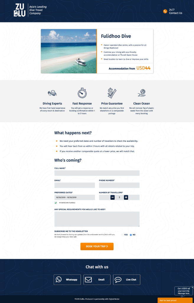
In the form step, users weren’t presented with the final price. They were only shown an average room price per night and limited options to customise their trip. The form was actually well below the fold. Unique Selling Points were still presented to users at this stage while they should be displayed higher in the sale funnel if at all necessary.
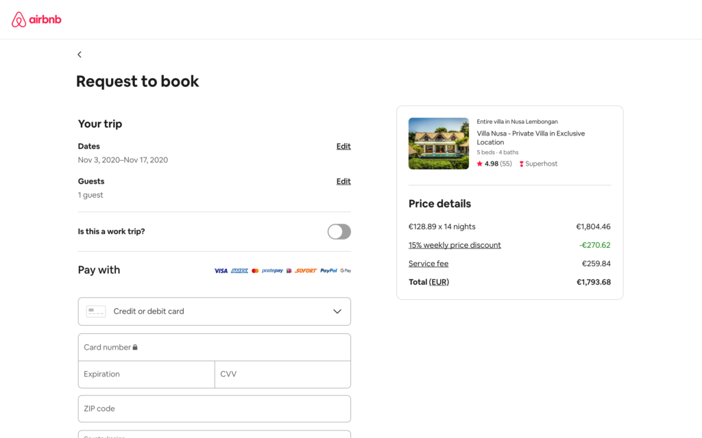
After completing this step, it would take up to a few weeks of back and forths between the user, our salesperson and our suppliers to conclude a deal. The experience was functional but felt incomplete and clunky compared to the ones provided by industry leaders such as Airbnb or Booking.com.
Role
When I started working on this project, ZuBlu was outsourcing everything. There weren’t any Designers, no Product Managers and only a single part-time Engineer. Because the team was so small, I was paired directly with Adam, our CEO, and provided input on many different topics such as marketing, engineering and of course design. For the first time, I had the chance to use most skills I had acquired during my career.
Approach
We researched and defined what was missing for users to enhance their purchase experience on our platform. We first looked at what other direct and indirect competitors were doing. We then proceeded with users and internal salespeople surveys to learn what was the most important information users needed in order to make a successful purchase.
After analysing the results, we realised that most users would be either certified divers or want to learn scuba diving, that the average booking would be 2.2 guests and that users only needed some basic but valuable customisation options. Based on these findings, we decided to limit trip customisation options. This would allow us to create a simple and quick user flow for the majority of our users.
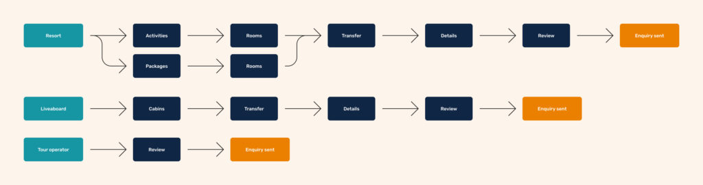
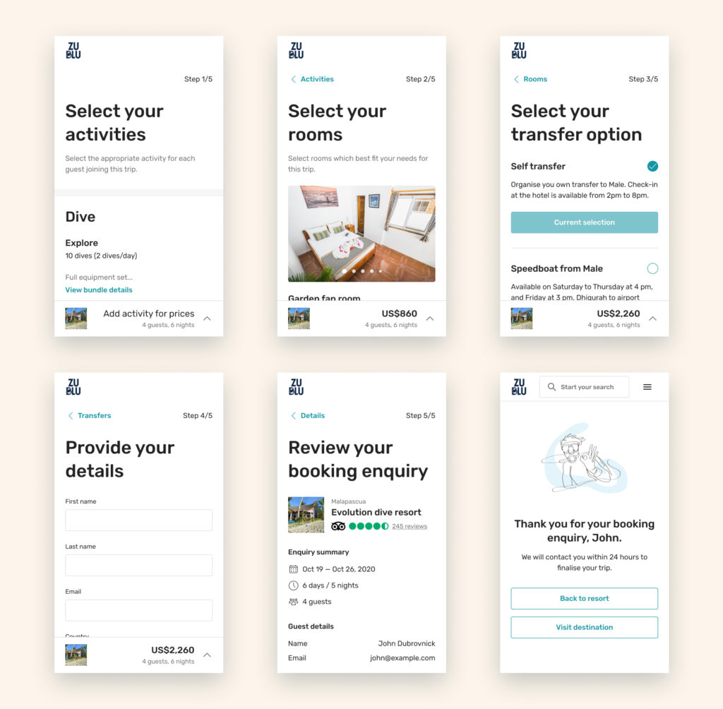
We created a 5 steps flow where users could select activities (diving, snorkelling, learning), select rooms (type and amount), select transfer options (self-transfer, car, boat, etc.), provide their details (name, email, phone, etc.) and finally review their enquiry before sending it over. Amount of guests and travel date would be informed on the supplier page, before entering the booking flow.
Solution
After testing different iterations, we validated three different flows for custom resorts, package resorts and liveaboards. On top of this, we added a quick checkout flow for large groups, activities and eco-ventures. This quick flow allows our sales team to handle group bookings which usually need more customisation and provide higher revenue.
The default flow booking flow was now:
- User visits a supplier page
- User starts an enquiry with dates, amount of guests and amount of rooms
- User completes a 5 steps checkout:
- Activities
- Rooms
- Transfers
- Details
- Review
- User enquiry is sent to the users for confirmation, to the sales team in Zoho for follow-up and to the supplier for availability request
- Supplier answers yes or no to email
- If yes, our salesperson validates trip and send a payment link to user
- If no, our salesperson picks up the conversation and offers another resort to the user
- User pays with the payment link
- User receive the booking confirmation
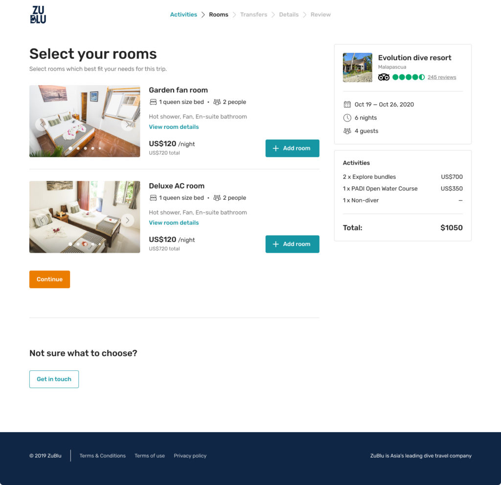
With each flow, we were able to solve our pricing transparency and trip customisation issues for 90% of our users. The last 10% of users who might need in-depth customisation are invited to contact our sales team directly so that we can create the perfect trip for them. We went from an average booking process length of 7 days to an average of 2 days.
Challenges
During ideation, we realised that one of our product subcategories, package resorts, was much more complicated than anticipated. It had much more constraints than its sibling, custom resorts. This type of resort would only allow users to arrive on certain weekdays and for a fixed amount of time. They would have prices per user type (diver, non-diver) rather than prices per room type which would create a complicated price matrix that seemed neither easy to grasp nor flexible for users.
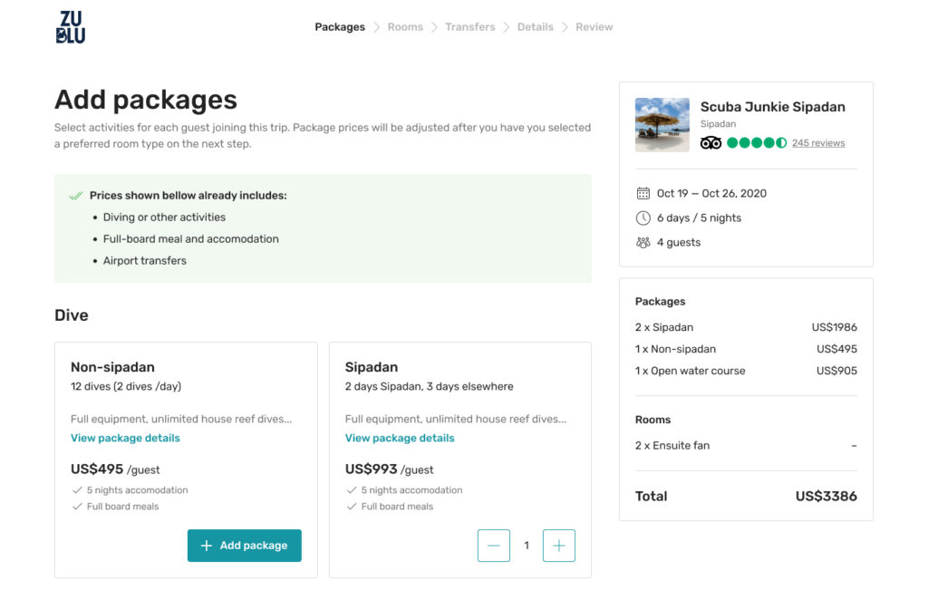
After exploring different solutions and based on the fact that most bookings had only 2 guests, we decided to greatly simplify this product by allowing users to select only a single room type rather than multiple rooms from any type. This greatly simplified the price matrix for 90% of our users.
Some product specificities are to predict and can only be discovered through user testing. When we first tried to apply the custom resort flow to our package resort product, we quickly hit a wall and had to go back to the drawing board.
Results
At the time of writing this case study, we have had really little user feedback regarding those two valuable functionality redesigns. The global pandemic and the travel limitations it created made our business and platform traffic to a halt. We will monitor the result of this work in the coming months when international vacations resume which will, in turn, allow us to iterate on the current design.
Learnings
The main learnings acquired during this project have been more related to the global situation rather than the design process itself. How to test a solution when no one uses a product (no international travels in 2020)?
I always advocate for evidence-based design with proper research to learn and iterate, yet sometimes, going with one’s assumptions, quick guerrilla testing and monitoring live results is a quick and efficient way for small teams to deliver fast.