Information architecture
Settings and configurations
Remodelling a settings information architecture so that users can easily configure an app to fit their needs.
Summary
When products get more and more complex, things can progressively get out of hand. In 2018 we had been adding complexity to our product for more than 10 years. After spending a year shipping cool features and improvements, I could feel an issue growing and I started asking:
How can we start making sense of our settings and configurations?
Problem
Over the years, every product organically becomes more complex. New features are added and users need to configure them. For example in Pipedrive’s case, new users needed to get their pipelines matching their sales processes, invite their colleagues or link Pipedrive with their existing tools. It happens sometimes that whole features such as security ones are app configurations.

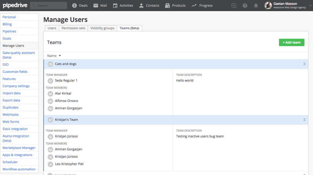
In 2017, over the course of one year, Pipedrive added more than 10 new features to its web app and increased functionalities of many existing ones. The settings menu jumped from 10 to 25 items. This huge section of the product was getting cluttered and unusable. Since research showed that trial users who would configure Pipedrive to suit their needs were 60% more likely to convert to paying customers, we decided to tackle this issue.
Role
From my first day at Pipedrive, I worked on features related to ecosystem (app marketplace), configurations (billing, user management) and product marketing (in-app upselling). One of my major skills is breaking down complicated problems into actionable items while managing stakeholders expectations. Because this issue had consistently impacted my work, I was eager to focus on this design problem.
As Lead Product Designer for this project, I had to interact with more than 13 different product teams. I had to make sure that we would meet their requirements, keep legacy features functional and allow users to achieve a variety of goals.
Approach
Most of Pipedrive’s features have some kind of configuration page and some features, such as workflow automation, are located in settings. With more than 50 unique views, the settings section was at the time the largest of the product. We decided to step back and analyse where we were starting from and what would be the right information architecture.

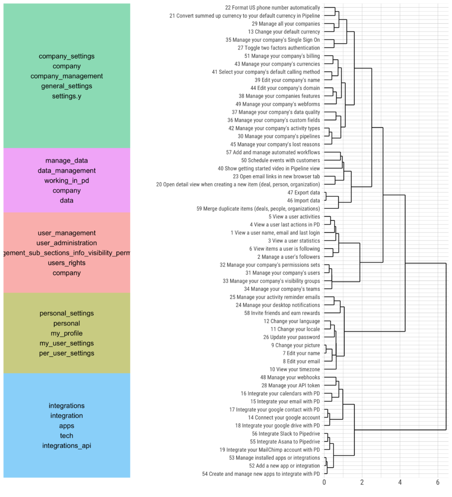
We started by creating a product map for the whole app to visualise its current state. This map made us realise the extent of the problem: there was no logical information architecture in place. To make sense of this, we decided to proceed with an open card sorting exercise.

We listed all actions a user could take in settings and assigned each one to a card. We conducted one on one interviews where we asked users to logically group all our cards. Upon completion, they labelled each group based on its content. After reviewing the results, we sat with our stakeholders to group all our configuration options into sections and subsections.

From there I build a Vue.js prototype to test and iterate on different grouping and UI approaches. At that point, we had many questions to answer:
- Would it be better to have a feature configuration inline (sitting in the feature itself) or sitting in settings?
- How will users discover a feature or a global setting?
- Should settings be managed by each individual team and how can everything stay aligned?
Instead of imposing rigid processes or constraints to our product teams, we decided to create a framework where each team could implement their own settings. We would still be there to check that everything would be aligned and we would be available to advise teams when they had to create new settings views.
Solution
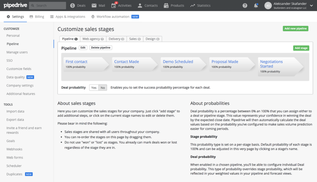
After testing 7 different iterations, we settled on one which fitted our user mental model and our product requirements. We defined four buckets:
- Settings
- Billing
- Tools and Integrations
- Workflow automation
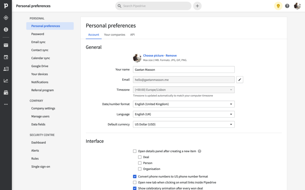
We decided to bring some configurations out of settings and treat them as features. We also encouraged product managers and product designers to use in situ configurations whenever appropriate so that users could instantly see changes without having to move out and back to the feature.

Since I have left Pipedrive the solution has kept on evolving. The main navigation was redesigned which in turn modified settings information architecture further. Because of our new settings framework, designers and product managers have already made use of the solid foundations we created.
Challenges
The greatest challenge in this project was to define ownership and manage expectations. This project involved 13 different teams across 3 offices. We could say that the settings section was owned by everyone and by no one at the same time. It has been developed for 10 years and had a life of its own. I remember when we started looking at it all and told each other: “All right, where the hell do we start?” Everyone wanted changes to happen but no one had time to work on it.
Those challenges were met with a passion for creating awesome products and improving our users’ lives. All teams got behind us and slowly but surely we managed to bring this project from a coffee break chat to a full-blown adventure where people felt empowered.
Results
The project delivery was really well received. We successfully created a framework for all product teams to work with feature configurations. Obviously, this is an ongoing project. Existing and new features configurations will need configurations. Our proposed solution paved the way for the new navigation redesign and the creation of a product team dedicated to settings and configuration.

Learnings
There were so many different learnings during this project that I’m not sure where to start. First it was a really great adventure. I got to work with every single product manager and designer or Pipedrive. I improved a lot regarding communication and managing stakeholders’ expectations.
Secondly we really saw the value for a designer to be able to code simple prototypes and get them tested. This allowed us to easily share our progress with other stakeholders and get support from everyone involved.
Finally, I learned that there is no right or wrong time to start a project. If something really interests and triggers you but no one seems to care and pay attention, start working on it a few hours a week, slowly get your management to see the value and at some point, it might become a company priority.