UX Strategy
Tiers up and down
Improving features discovery and creating account upgrade flows to increase growth and revenue.
Summary
Pipedrive is the first CRM platform made for salespeople, by salespeople.
Designers, marketers and product managers love to regularly add new “cool” features to their products. But we started shipping 3 or 4 new features a year, a couple of questions started crossing our minds:
How do users discover new features and their value?
How do users upgrade their accounts and have access to extended functionalities?
Problem
When a product has a solid user base, such as the Pipedrive’s one, comes a time when management wants to make sure that company’s growth rate stays steady. Pipedrive at the time offered a 14 days free trial followed by three paying tiers: silver, gold and platinum. Before we started this project 90% of users were using the Silver offer. The Gold tier was offering minor functionality improvements if not for the Email Inbox functionality. The Platinum tier was mostly a marketing trick encouraging users to subscribe to our mid-tier offer: Gold.
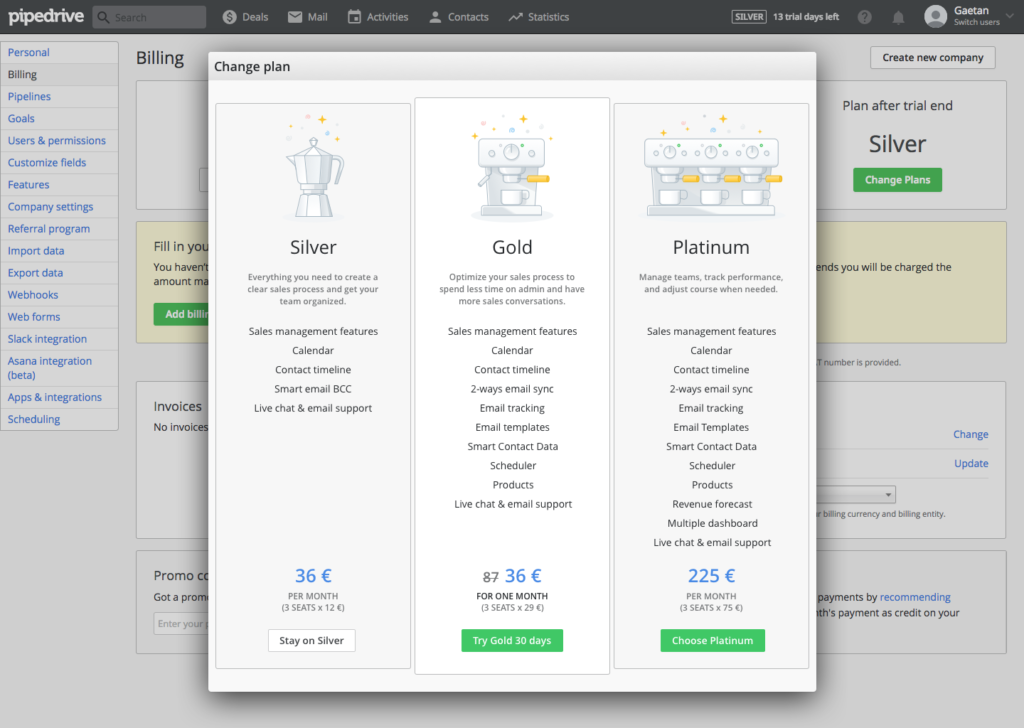
To boost revenue, our management decided to redesign our two highest tiers. Gold tier was to be tailored for midsize companies with features such as workflow automation or email templates. Platinum tier would focus on the corporate market with security features such as two-factor authentication or single sign-on. We had 3 months to figure out how to raise user awareness about those new functionalities, help users understand their value and encourage users to easily upgrade their subscriptions.
Role
For this project, I was given the Lead Product Designer role. I joined one of our product marketing engineering teams. I was tasked to research how to promote each new feature, coordinate delivery dates with each team tasked to implement the marketing material themselves, make sure that it was implemented according to specs and produce a simple solution for users to upgrade their plans.
Approach
The first thing we did was to define the problem better and divide it into actionable items:
- How can paying users discover features from higher tiers?
- How can paying users understand the value of features they don’t have access to?
- How can paying and trial users easily upgrade or downgrade their subscription?
- How can trial users know on which tier they are currently using the app?
The first two issues were explored with the product marketing team. We already have a solid idea of what we wanted to do there. We had some quick brainstormings to define the direction and started ideating on potential solutions.
The third and fourth issues were solved together with our sales and billing team. The billing functionality was one of the oldest legacy features still in production. Our engineering options were limited here and we needed to deliver this fast. We couldn’t launch our new tier revamp if users couldn’t upgrade their subscriptions.
Solution
In order to solve our first problem regarding higher tier features discoverability, we decided to simply make the features visible in our navigation and to add a simple icon next to their labels. Before, users from lower tiers were totally blocked out of those features and not even aware of their existences.
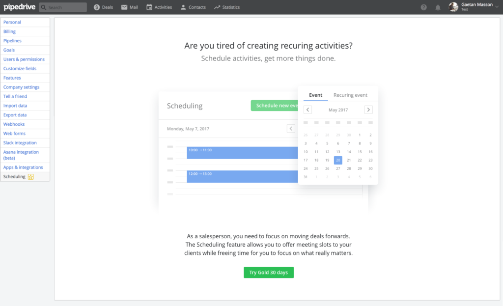
The second problem was solved by creating custom empty states for each feature. Now that users could discover them, we provided them with more information about the functionalities. Each empty state was designed in collaboration with the designer owning the feature and implemented directly by his or her team. Empty screens would include a UI sneak peek related to the feature goal, a little tagline and an “Upgrade” CTA.
The third issue was tackled by designing a modal presenting each tier’s features and price. This modal was made as a global component and could be triggered from anywhere in the product. The main issue here was allowing users to understand the value of each tier. We couldn’t just list 40+ features in Platinum without making the modal unusable. We decided to break away from the way our marketing team was displaying features on the web. We only displayed features belonging to each tier, clear pricing and an “Upgrade” CTA.
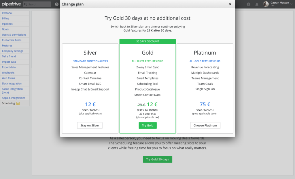
The fourth and final problem was dealt with by adding tier badges to our top bar for trial users. Clicking on the badge would open our billing modal and allow users to compare our subscription plans. In addition to this we added a trial length reminder next to the badge so that users could plan and make the best out of their trial period. Since we increased the trial length to 14 days as well as the price of each tier, it was important to increase trial and pricing transparency.
Challenges
With so many issues to tackle, there were a variety of challenges. We had to handle legacy features that no one really wanted to deal with. Billing for example was still part of the monolith PHP code and hadn’t been updated with microservices. That made it difficult to improve the user experience there, hence the use of a modal rather than a checkout page.
Another challenge was to deliver meaningful empty states for each team to implement at the right time. There was a strong push from our management to get enough features ready for the pricing and tier relaunch. All teams were working night and day to get their part over the finish line and we had to use a lot of diplomacy to have them buying in our project.
Another challenge was related to finding the right marketing strength. We strongly believed that our Gold tier was the one offering the best value for money and the best functionalities. We encouraged users to subscribe for this tier but at the same time we didn’t want to be pushy or upsell users with a product they didn’t actually need.
Results
One great thing about this project is that we could easily measure success. After three months, we look at our metrics and see what happened. Which percentage of users were now on the Gold plan? Had the trial to paying customer conversion rate increased?
After analysing the data, we were pleased to see that Gold tier conversion went up from 9% to 47% of trial users and Platinum tier conversion go up from 1% to 5% of trial users. It seemed that trial users were seeing the value in our Gold tier offer and were willing to commit to that tier.
On the downside, we reported a decrease in our trial to paying customer conversion rate. We knew that by increasing all our tier subscription fees while putting trial users on Gold tier by default, we were taking the risk of lowering conversion rate. Since it was the case, we decided to investigate further and iterate based on the investigation feedback.
Learnings
This project was my first official project at Pipedrive and I learnt a lot from it. I realised that managing stakeholders’ expectations is primordial and ensures success. Being clear from the start on the goals we wanted to achieve and the resources at our disposal, helped us get everyone’s support.
I learned to deal with feature legacy and engineering limitations. We often asked ourselves: what is the best we can make of the current situation within our current deadlines? We had designed for the best case scenarios before realising that our user flows would take 6 to 9 months to build while we only had 3 to deliver our project. This was a hard-learned lesson and we had to go back to the design board and start all again.